An AI-powered low-code web app builder, transforms ideas into applications effortlessly
Client
GenCodex
Year
2024
Gencodex is a no-code AI platform designed to help businesses build applications, automate workflows, and integrate intelligent systems without writing code. As a Senior UI/UX Designer, I led the end-to-end design of the product, working closely with the Tech Lead, AI team, product managers, and stakeholders to transform a technically complex system into an intuitive and scalable user experience.
The project focused on bridging the gap between powerful system capabilities and real-world usability. By redesigning core product screens such as onboarding, dashboard, workflow builder, and AI configuration panels, I introduced guided interactions, reduced cognitive load, and improved overall task clarity. The approach emphasized system thinking, modular design, and real-time feedback to ensure users—especially non-technical ones—could confidently navigate and utilize the platform.
This redesign not only enhanced usability but also delivered measurable business impact, including improved user activation, higher task completion rates, reduced support dependency, and increased feature adoption. The project reflects my ability to solve complex UX challenges, design scalable systems, and align user needs with business goals in AI-driven products.
Scope of Work
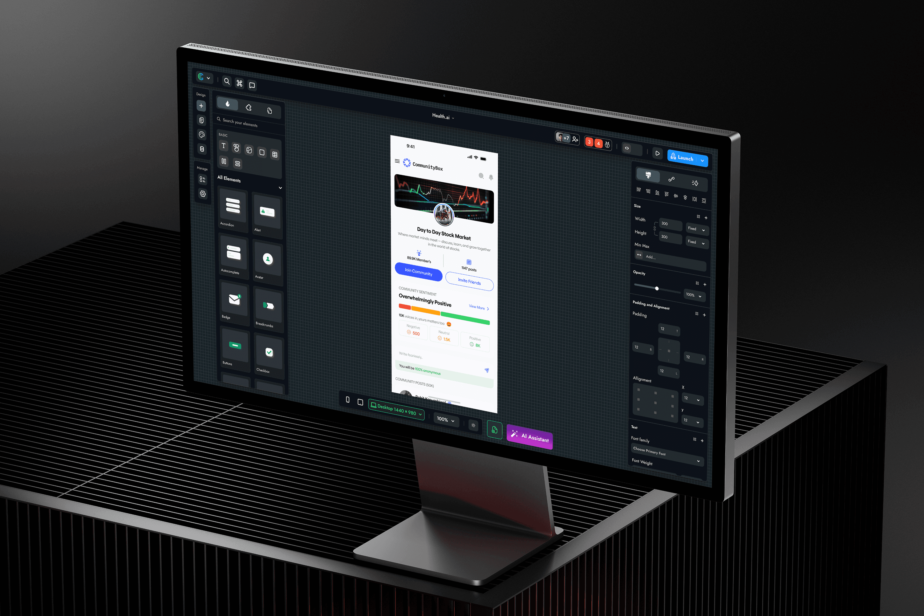
Project Overview
GenCodex is an AI-powered low-code platform developed by SAG Infotech that empowers businesses — particularly SMEs and non-technical entrepreneurs — to build production-grade web apps and mobile applications through an intuitive drag-and-drop interface, pre-built component library, and AI-assisted builder.
Unlike traditional code-heavy frameworks, GenCodex democratizes software development by abstracting technical complexity and replacing it with visual, conversational, and intelligent interactions. The platform targets the massive underserved market of businesses that need digital products but lack the budget or technical talent for traditional development.
The product had strong technical capabilities but lacked usability maturity. My role was to bridge the gap between system complexity and user understanding, ensuring that users could not only use the platform but succeed with it.
Role & Ownership:
Led end-to-end UX across multiple modules
Collaborated with Stakeholders, AI Teams, Front-end and Back-End Engineers, product managers and other Teams Members
Defined system-level UX patterns and interaction models


Problem Statement
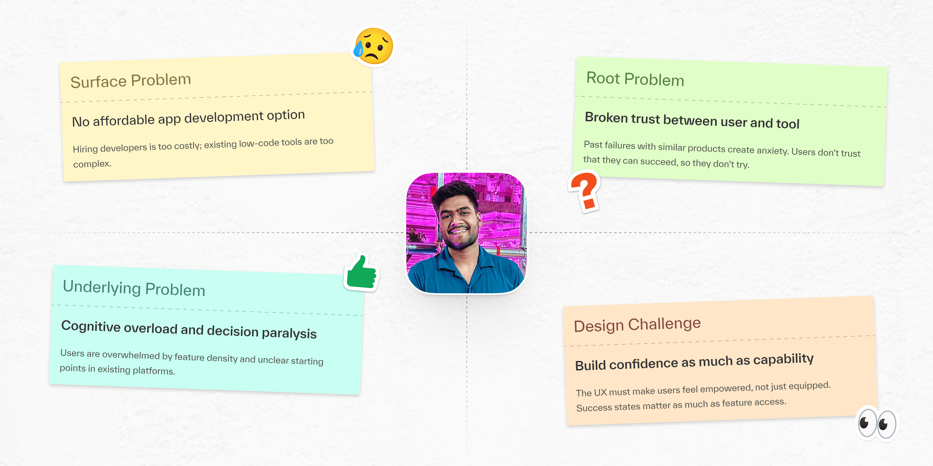
The initial brief was to "design a low-code tool." But early stakeholder conversations and user interviews revealed a much deeper, multi-layered problem that required reframing before any design work could begin.
The surface problem was "businesses can't build apps." The real problem was a trust and capability gap: users didn't believe they could do it, and existing tools reinforced that belief through poor UX.
Key Findings
Overwhelming and complex interfaces
Lack of clear starting points
Low user confidence due to past failures
Trust gap between users and tools
Core Challenge:
How do we simplify a highly flexible, AI-driven system into an experience that feels guided, predictable, and easy to operate?
Business Goals and Success Metrics
Before starting any design work, I facilitated a goal-alignment session with business stakeholders and the product team to define what success actually looked like. This produced three business goal pillars — each mapped to specific UX metrics — that served as guardrails for every design decision throughout the project.
Goal Pillar 1 - Acquisition
Business Goal: Improve trial sign-up conversion from the marketing landing page.
UX Objective: Communicate platform value within the first 10 seconds. Reduce cognitive load between landing and first in-product action.
Key Metrics: Sign-up conversion rate, Time-to-first-interaction, Landing page bounce rate
Design Focus: Landing page value clarity, onboarding entry redesign, zero-friction registration flow
Goal Pillar 2 - Activation & Retention
Business Goal: Ensure users reach their first meaningful product outcome within their first session.
UX Objective: Design the path to the first 'aha moment' (a published app) as the default journey - not something users discover by accident.
Key Metrics: First-session activation rate, D7 retention, AI builder adoption rate, Feature usage depth
Design Focus: Progressive onboarding, contextual feature disclosure, AI builder UX, first-publish celebration
Goal Pillar 3 — Monetisation
Business Goal: Improve trial-to-paid conversion rate without aggressive upgrade pressure.
UX Objective: Design upgrade moments that feel contextually helpful — surfaced at the moment of need, not pushed arbitrarily.
Key Metrics: Trial-to-paid conversion rate, Average revenue per user (ARPU), Plan upgrade click-through rate
Design Focus: Pricing page clarity, feature gate UX, contextual upgrade prompt design

User Research
Research was conducted in three phases across the product lifecycle - exploratory discovery, solution validation, and post-launch evaluation - to ensure decisions were grounded in real user behaviour rather than assumptions.
Methods Used:
1:1 stakeholder and user interviews
Session recordings and behavioral analysis
Usability testing on critical workflows
Feedback from support and product teams
Phase Breakdown:
Discovery (Phase 1)
24 in-depth interviews with SME owners, startup founders, and department managers. Goal: understand current app development pain points and unmeet digital ambitions. Method: semi-structured contextual inquiry.
Validation (Phase 2)
8 moderated usability test sessions using lo-fi and hi-fi prototypes via Maze. Identified 23 critical usability issues across core builder flows. Task completion rate measured and benchmarked.
Evaluation (Phase 3)
Post-launch: FullStory session recordings, heatmaps, and in-app feedback surveys. Findings fed directly into iteration priorities for the following 3 sprints.
This research highlighted a key gap:
The system was built for capability, but users needed clarity.

User Personas
Based on research findings, three primary user personas were defined to represent the core audience. Each persona had different goals, technical expertise, and expectations from the platform. However, a common pattern emerged - all users required clarity, simplicity, and reassurance while using the product. Designing for these personas helped ensure that the platform caters to diverse needs while maintaining a consistent and intuitive experience.
Persona 1 — The SME Owner
Context: Runs a boutique clothing store. Uses WhatsApp, Instagram, and Google Sheets daily. Has never used a development tool.
Primary Goal: Launch a customer-facing app to accept orders and manage inventory - without depending on a developer or paying developer rates.
Emotional State: Cautiously hopeful but easily discouraged. Interprets confusing interfaces as personal failure rather than product shortcomings.
Key Frustrations: Overwhelmed by feature density on first use, Fears making irreversible changes, Previous tools felt 'built for coders'
Design Implication: Design for psychological safety first. Every screen must make Priya feel capable, not confused. Error-free first sessions are non-negotiable.
Persona 2 — THE Startup Founder
Context: Building an early-stage B2B product. Understands technology conceptually but doesn't code. Has used Webflow and Notion extensively.
Primary Goal: Ship a testable MVP in days rather than months, iterate on real user feedback, and avoid burning runway on developer time.
Emotional State: Impatient and results-driven. Willing to explore features - but loses confidence when the tool doesn't keep pace with his thinking.
Key Frustrations: Customisation ceiling hits too early, API integrations require too much technical knowledge, Waiting for dev slows his iteration speed
Design Implication: Advanced features must be accessible without being in the way. Power users need escape hatches from simplified modes.


User Journey Mapping
Rather than mapping a purely functional task sequence, I built a full emotional journey — capturing what users were thinking, feeling, and doing at each stage, alongside the UX failures and design opportunities at every touchpoint. This map became the strategic backbone of the redesign, directly informing prioritisation decisions for every design sprint.
Journey Map Critical Findings
Biggest Drop-off Point: (Stage 2) - Sign-up to first action. 67% of new users left without creating a project during the original experience.
Highest Emotional Value: (Stage 4) - AI builder discovery. Users who found and used the AI builder had 3× higher D7 retention than those who didn't.
Most Misunderstood Stage: (Stage 6) - Publish. 44% of beta users shared preview links thinking they were live, creating broken experiences for their customers.

Pain Points & Opportunity Areas
Pain points were documented not just as problems but as paired opportunity briefs — each with a specific design direction, a hypothesis for how the redesign would perform, and a measurable signal for validating the improvement. This structure ensured every design decision had both a research basis and a success condition.
Insights are distinct from findings. A finding describes what users said or did. An insight explains why — and opens a design direction. These five insights were the most consequential outputs from the research phase, each generating a design principle or specific product decision that wouldn't have existed without the research.
Key Insights:
The first 90 seconds determine everything. Users form a lasting impression of platform capability within their first session. If they don't reach a success state in that window, they rarely return. This drove the entire onboarding redesign.
"Simple" doesn't mean "fewer features." Users don't want features removed - they want features that appear contextually. Progressive disclosure is more powerful than feature reduction.
Trust in AI is built through transparency. When AI systems explain their decisions - even briefly - users are significantly more likely to accept and iterate on AI-generated output.
Emotional momentum is a product feature. Small celebration moments - a published app notification, a completed step checkmark - dramatically increased session length and D7 retention scores.
Error messages are personal for non-technical users. Technical language in error states was interpreted as user failure, not system state. Plain-language error design was critical to user confidence and retention.


AI Integration Strategy
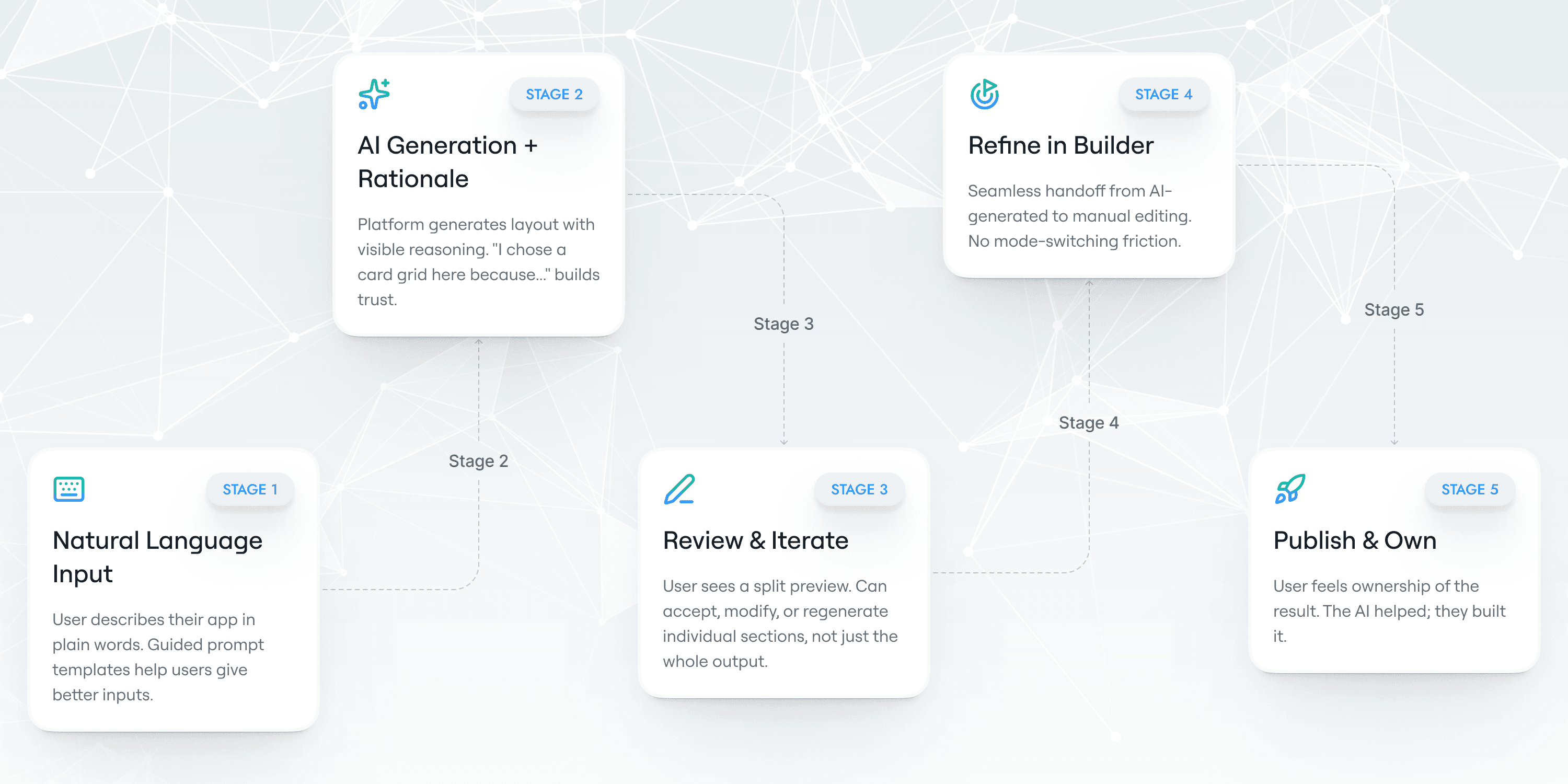
AI UX design is fundamentally different from traditional product design. In conventional UX, a user takes an action and receives a predictable, defined outcome. In AI UX, the outcome is probabilistic - it might be excellent, it might be wrong, and the user needs to be able to evaluate, iterate, and remain in control regardless. Designing for this required developing new patterns that didn't exist in our existing design toolkit.
I worked directly with the AI team across multiple sprint cycles to design a five-stage AI interaction model that balanced automation with agency - making the AI feel powerful without making users feel powerless.
AI UX Patterns I Originated For Gencodex
Prompt Guidance Templates: Structured input helpers that improved AI output quality without requiring prompt engineering knowledge. Now a standard pattern across all AI entry points.
Transparent AI Rationale Panel: Plain-language decision explanations on all AI-generated sections. Became a platform-wide standard for every AI feature.
AI Failure Recovery Flows: Dedicated UX for timeouts, ambiguous inputs, and unsupported requests — each with a specific recovery path and plain-language explanation.
Key Product Modules & Screens
1. Project Management Module
This module acts as the control center where users manage projects, tasks, and workflows.
Design Focus:
Clear project hierarchy
Easy navigation between tasks
Status visibility and tracking
Improvements Introduced:
Simplified dashboard with actionable insights
Reduced clutter through structured grouping
Clear status indicators for quick understanding


2. App Builder Canvas
The canvas is the core experience where users build applications and workflows.
Design Challenges:
High complexity due to multiple components
Difficulty in understanding flow logic
Design Solutions:
Introduced a visual drag-and-drop interface
Clear connection mapping between components
Real-time visual feedback for user actions
Outcome:
Users could now “see” their workflows instead of imagining them.

3. Configuration Panel
This is where users define logic, inputs, and system behavior.
Pain Points:
Dense forms with technical terminology
Lack of clarity on expected inputs
Design Improvements:
Grouped configurations into logical sections
Added contextual guidance and helper text
Reduced visible complexity using progressive disclosure


4. AI Integration Interface
AI capabilities were powerful but difficult to interpret.
Design Approach:
Simplified AI interactions into input-output flows
Provided clarity on what AI does and returns
Introduced feedback loops for better understanding

Onboarding & Sign-Up Experience
The onboarding and sign-up experience is the user’s first interaction with the platform, where clarity and simplicity are critical to building initial trust and engagement.
Enhancements:
Simplified sign-up flow with minimal required inputs
Step-by-step onboarding to guide users from the start
Clear progress indicators to show completion stages
Contextual guidance to help users understand next steps


Impact & Results
The results below are organised by category to show not just what improved, but where design investment had the highest leverage. Each metric is paired with the specific design decision that drove it — demonstrating the direct line from UX decision to measurable outcome.

Learnings
Case studies that skip the learnings section skip the most honest part of the work. Every project produces insights about craft, process, and collaboration that make the next project better. These four are the ones that most durably changed how I approach design work.
Key Takeaways
AI UX = Designing for Uncertainty
Designed experiences that support both correct and incorrect AI outputs, ensuring users can evaluate, correct, and stay in control.Design Systems Multiply Impact
Initial effort scaled into faster development, consistent UI, and improved product trust.Design Must Speak Business
Framing UX in metrics (e.g., onboarding ↑ from 33% → 78%) made design a strategic driver, not just execution.Early Tech Collaboration is Critical
Involving developers early led to more feasible designs and better final outcomes.
Conclusion
GenCodex wasn’t about building features - it was about closing the gap between powerful AI and real users. The platform worked, but the experience didn’t. By simplifying structure, clarifying language, and designing for trust, we turned complexity into usability. The real success isn’t just in metrics like 85% task success or faster publishing - it’s in the moment a non-technical user confidently launches their first app. That’s when design did its job: not making things look better, but making users feel capable
Final Thought
This project wasn’t linear - it was iterative, messy, and full of course corrections. A single word change improved completion by 28%, while entire flows had to be rebuilt from scratch. That’s the reality of product design. What GenCodex reinforced for me is that design is ultimately an act of translation - aligning business goals, technical possibilities, and human understanding. The impact comes from small, thoughtful decisions made with clarity, evidence, and collaboration.
The real success of GenCodex isn’t in the metrics — it’s in the confidence it gives its users.